
Table of Contents

The SWAT WATER Station helps you understand how much water is available to your crop, where that water is stored within the soil profile, when moisture levels may begin to limit crop performance, and how these conditions vary between SWAT Zones.
This guide explains:
- What the system measures
- How to read each dashboard
- What common patterns mean
- How to use the data for management decisions
How the SWAT WATER Station Works
Each SWAT WATER Station installation includes:
- Soil moisture probes permanently installed in 3 SWAT Zones
- 8 soil moisture sensors measuring water content in 15cm increments between 20 and 140cm depth per SWAT zone
- A datalogger and tipping bucket rain gauge installed in an uncropped/field edge location
The system measures Volumetric Water Content (VWC) and converts it into Plant Available Water (PAW). The unique soil water holding capacity properties, and how they vary over the soil profile (ie. wilting point, field capacity, and porosity), are learned for each probe location through automated interpretation of the soil moisture observations.
The accuracy and quality of the soil water holding characteristic estimates will increase over time. Initial PAW values need to be interpreted with caution for the first 4 weeks after installation as soils settle and soil to sensor contact stabilizes. Between 4 to 8 weeks after installation estimates of the soil water characteristics generally stabilize but depends on environmental conditions. The system will stabilize more quickly with more observed precipitation events. During this stabilization period interpretation of the information should be focused on the relative differences between zones and layers vs absolute values.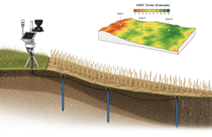
For the installation of a permanent in-field soil moisture sensing system, soil probes are required to be buried at a depth of 20 cm. This depth is generally adequate to prevent equipment damage in most zero-till situations. Although the 0–20 cm soil layer is not directly measured, the volumetric water content (and corresponding plant-available water values) is estimated using a water balance model. This model integrates observed rainfall data, soil evaporation estimates, and observed subsurface soil moisture dynamics. An optional weather sensor add-on (mounted on the edge of field data logger), provides additional observations of air temperature, relative humidity, wind speed and direction, and solar radiation.
Key Terms
Available Water (AW): The portion of soil water a plant can actually extract from the soil.
- AW (%)= Volumetric Water Content (%) – Wilting Point (%)
As AW decreases it becomes more difficult for a plant to extract water from the soil.
Potential Plant Available Water (PAW): The maximum amount of water a soil can hold that is plant available.
It is the range of water holding capacity between field capacity and wilting point
- PAW (%)= Field Capacity (%) – Wilting Point (%)
Field Capacity: The upper limit of volumetric water content a soil can retain against the force of gravity through capillary forces (full but not dripping).
Wilting Point: The lower limit of volumetric water content that plants can draw water from the soil. Below this level plants cannot exert enough tension to extract water to overcome soil capillary tension.
Volumetric Water Content (VWC): Raw moisture reading from each sensor (shown as %). The percent volume of a volume of soil that is composed of water.
- These different properties are expressed either in terms of percent (%) or depth (mm) when considering defined soil layers
Understanding Stress Colours
Plants will preferentially draw the most accessible water first. Crop water stress is a gradient, as available water decreases plants need to exert more effort even before wilting point is reached. General crop stress thresholds as a function of PAW are included in the app via color coding to contextualise potential crop water stress conditions as follows:
🟢 Green (No Stress): More than 50% of PAW available. Plants can easily extract water, grow efficiently, and are not limited by moisture
🟠 Orange (Water Stress) : 25–50% PAW. In this range, plants can still access water, but it requires more effort. Growth begins to slow, and the crop becomes more sensitive to hot, windy, or dry conditions. Prolonged time in this zone may start reducing yield potential.
🔴 Red (Severe Stress): Less than 25% PAW. Plants can no longer extract enough water to support normal growth. Yield loss is certain if this level of stress occurs at any stage other than during late season ripening/senescence.
Accessing the SWAT WATER STATION APP
The information reported by the SWAT Water Station is reported through the SWAT RECORDS interface of the Mobile App. Data for a SWAT Water Station is connected to the app at a farm level and will only be visible to users with the permissions to sync the respective farm. The SWAT Water Station link leads to a page that lists the available stations for that farm. Each station card shows the field name, serial number, display name, message count, and the date of last received data. Tap a station card to open it.
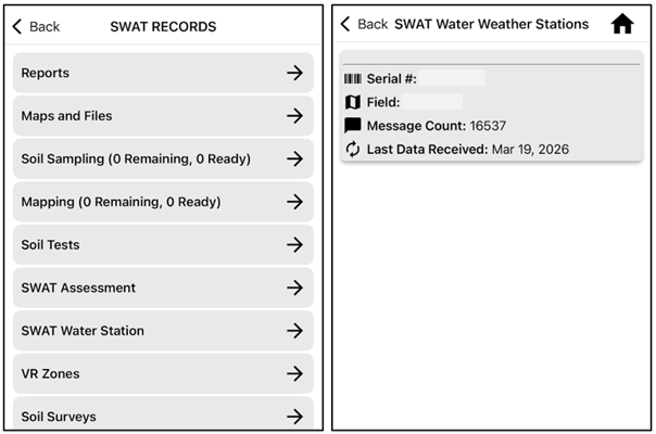
Note on Syncing: When loading the Mobile App a prompt to complete a sync regularly appears and pending connectivity of the mobile device can take time. This sync is required to sync files and reports between the SWAT RECORDS server and the mobile app. SWAT WATER station data is available independent of this sync process, so if a user is only interested in viewing SWAT WATER Station data quickly, this sync can be bypassed.
Getting Around the App
Each station page is organized into three tabs along the bottom of the screen:
-
- Weather Observation — the dashboard and weather charts (rainfall, temperature, wind, solar, air pressure)
- Soil Moisture — plant available water, volumetric water content, and crop water use
- Soil Temperature — soil temperature trends and depth profiles

Within each tab, three controls at the bottom of the screen drive what you see:
- Select View — a dropdown that switches between the different charts available in that tab.
- Export — exports the current chart and table to a pdf for sharing purposes.
- Options — opens a panel of settings (dates, comparison years, and display modes) for the chart you are viewing. See the next section.
Interacting with Charts
The charts are interactive:
- Tap a point on a line to see a tooltip with the exact date, time, and value.
- Tap an item in a chart legend to hide or show that series — for example, hide one year to focus on another, or hide a zone to declutter a busy chart. Hidden legend items appear dimmed; tap again to bring the series back.
- Each chart has an info (i) button beside its title that opens a short explanation of what the chart shows.
Comparing Years
Most charts can overlay multiple years of data on the same plot, aligned by calendar date, so you can directly compare this season against previous seasons. Years are selected in Plot Options; every year from 2024 (or the first year a SWAT Water Station came online) to the current year is available. When several years are shown, the legend indicates which line belongs to which year — on most charts the most recent year is a solid line and earlier years use dashed or dotted styles; on some charts (such as Rainfall) each year has its own colour instead.
Plot Options
The Plot Options button opens a settings panel for the current chart. Only the settings relevant to that chart are shown:
- Observation Date — a month and day (for snapshot charts such as the PAW by zone view) or a start and end month/day range (for time-series charts). The default range is the last 7 days. Note the date window is month/day only — the year(s) shown come from the Comparative Historical Years selection.
- Comparative Historical Years — select one or more years to overlay on the chart. The Wind Rose can only display a single year.
- Depth — for the Soil Temperature over time chart, choose which sensor depth to plot (e.g. 23.5 cm, 80 cm, 120 cm).
- Display — some charts have more than one display mode:
- Rainfall: Accumulated or Daily
- Temperature: Temp & Humidity or Delta-T
- Wind: Speed & Gust or Wind Rose
- Crop Water Use: Daily, Cumulative, or Root Depth
- Reset Defaults restores the standard settings; Apply updates the chart.
Weather Observations
For standard stations (a tipping bucket rain gauge without add-on weather sensor) the weather observations are limited to precipitation only, and the Weather Observation tab offers only the Dashboard and Rainfall views. For stations with the weather station add-on (a tipping bucket rain gauge and add-on weather sensor) the weather observations include precipitation, air temperature, relative humidity, wind speed and direction, solar radiation, UV index, and air pressure.
Dashboard
The dashboard provides the entry point to the weather data with a quick-look summary of current conditions. A toggle at the top switches between two modes: 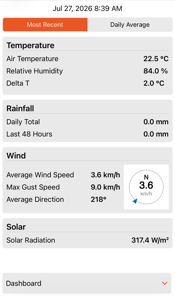
- Most Recent — the last observed weather conditions, with the time of the latest reading shown at the top.
- Daily Average — average conditions for a selected date (choose the date via Plot Options).
The dashboard tiles show:
- Temperature — air temperature, relative humidity, and Delta T (an indicator of spraying conditions — see the Temperature section).
- Rainfall — the daily total and the total for the last 48 hours.
- Wind — average wind speed, maximum gust, and average direction, with a compass indicator. The compass arrow points from the direction the wind is blowing from, toward the centre — the standard meteorological convention.
- Solar — solar radiation.
Tapping any tile opens the corresponding detailed chart. You can also reach the detailed charts through the Select View dropdown.
Rainfall
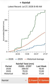 Summary: This chart shows rainfall for the season, either as an accumulated total compared to the long-term average, or as daily amounts. It provides a quick snapshot of whether the current year is wetter, drier, or tracking close to normal conditions.
Description: The date and time of the latest received reading is shown at the top of the view. In Accumulated mode the figure displays cumulative rainfall from the beginning of the selected date range — a green line for the most recent year, with any comparison years in their own colours — alongside the historical average cumulative rainfall curve (orange line, derived from the term climate data). Divergence between the lines highlights periods of excess moisture or rainfall deficits. In Daily mode the chart shows daily rainfall totals as bars, with side-by-side bars when comparing years. Below the chart, a Rainfall Total table summarizes rainfall for the selected period and for the last week, for each selected year and for the historical average.
Why it's useful: Understanding how in-season rainfall compares to historical patterns is essential for interpreting soil moisture distribution, crop stress, and overall yield potential. Differences in rainfall intensity also have major agronomic implications. High-intensity rainfall often exceeds the soil's infiltration capacity, leading to greater surface runoff and accumulation of moisture in lower-lying SWAT zones, while contributing less to deep soil recharge in upland areas. High-intensity rainfall is indicated by a steep upward step in the accumulated line. In contrast, low-intensity rainfall is more easily absorbed, allowing water to infiltrate uniformly and recharge soil water reserves more evenly across all landscape positions.
Air Temperature and Humidity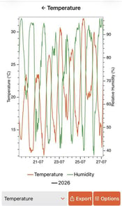
Summary: These charts provide 30-minute interval observations of air temperature and relative humidity, offering a clear view of daily and seasonal fluctuations.
Description: The air temperature and humidity chart displays how these variables change throughout the day and across the season. Temperature is plotted as the orange line (values on the left y-axis) and humidity is the green line (values on the right y-axis). When comparing multiple years, line style indicates the year; the temperature/humidity and year legends can each be tapped to hide or show lines.
Why it's useful: Tracking air temperature and humidity together provides valuable insights for managing field operations and mitigating crop risks. Knowing when temperatures approach heat stress thresholds, or when humidity rises to levels conducive to disease development, allows for better agronomic decisions. By visualising temperature and humidity together, the charts help explain daily evaporation rates, plant transpiration, and the likelihood of dew formation, which can all influence crop health and disease risk.
Delta-T -png.png?width=175&height=296&name=Image%20(1)-png.png)
Switching the Temperature chart to Delta-T mode (via Plot Options) shows the difference between dry bulb (air) temperature and wet bulb temperature — an indicator of atmospheric drying potential used to determine suitable conditions for pesticide spraying. The chart shows the calculated Delta-T value over time (one line per selected year) against colour-coded background bands:
- Green (2–8 °C): preferred spraying conditions
- Yellow (8–12 °C): marginal conditions
- Red (below 2 °C or above 12 °C): unsuitable conditions
Low Delta-T (below 2 °C) indicates high humidity or a possible temperature inversion; high Delta-T (above 12 °C) indicates excessive evaporation risk.
Wind Speed, Direction, and Gust
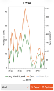
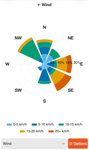 Summary: Wind speed charts display 30-minute average and maximum (gust) wind speed observations, capturing both daily variability and seasonal patterns. This enables users to assess how wind conditions fluctuate throughout the day and across different weather events, which is crucial for understanding impacts on spraying, pollination, and soil erosion risk. The wind rose charts further enhance the analysis by illustrating the distribution of wind direction and frequency, helping users recognize prevailing wind patterns and shifts throughout the season.
Description: Wind speed visualizations display two lines: one shows the 30-minute average wind speed in blue, while the other illustrates maximum gusts during each interval with a dashed orange line. The wind rose diagrams enhance these charts by summarizing the frequency and direction of winds throughout the season. Wind direction and speed are sorted into 10 directional bins, with wedge sizes depicting the relative frequency of wind from particular directions and their colours indicating how often specific wind speeds occur. Wind roses help users visualize prevailing wind direction and speed patterns.
Why its Useful: By monitoring wind patterns and gusts, users can optimize field activities such as spraying and irrigation scheduling, minimizing drift and maximizing efficiency. Additionally, recognizing shifts in wind direction and intensity throughout the season can inform decisions related to crop protection, pollination timing, and soil conservation practices.
Solar Radiation
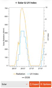 Summary: The solar radiation chart presents 30-minute average measurements of incoming solar energy, highlighting daily and seasonal patterns. These visualizations help users observe how radiation levels fluctuate due to cloud cover, time of year, and weather events, which directly influence crop growth rates and photosynthetic activity.
Description: Solar radiation visualizations depict the average incoming energy received at the surface, highlighting patterns shaped by day length, sun angle, and short-term weather events such as cloud cover (yellow line). The UV index (blue line) represents the intensity of ultraviolet radiation at the surface, measured at 30-minute intervals. This metric provides a clear indication of how UV exposure fluctuates throughout the day and season, driven by sun angle, cloud cover, and atmospheric conditions. Monitoring the UV index helps users understand periods of high ultraviolet risk.
Why its Useful: Observing solar radiation and UV index together helps producers understand how sunlight and ultraviolet intensity affect crop growth, stress, and field conditions. Periods of low radiation caused by cloud cover or smoke often line up with reduced photosynthesis and slower crop development. High radiation days increase evaporation, soil surface drying, and heat accumulation, which can influence plant stress and daily moisture use. These patterns also help explain differences in crop vigour across the season and support better decisions on seeding timing, in season management, herbicide performance conditions, and overall yield expectations.
Air Pressure
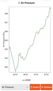 Summary: The air pressure chart provides 30-minute interval measurements of atmospheric pressure, capturing daily and seasonal fluctuations that influence weather dynamics and field conditions. Changes in air pressure often signal upcoming shifts in weather patterns, such as the arrival of fronts, storms, or periods of clear skies.
Description: The air pressure chart displays atmospheric pressure readings at 30-minute intervals (blue line).
Why its Useful: Fluctuations in air pressure are closely tied to changing weather conditions such as the passage of fronts, onset of storms, or clearing skies. Tracking these patterns can support planning for fieldwork, as sudden drops in pressure often indicate incoming precipitation or increased wind activity, while steady or rising pressure suggests stable conditions. By integrating air pressure data alongside other environmental parameters, users gain a more comprehensive understanding of local weather dynamics and their potential impact on crop management decisions.
 Soil Moisture
The Soil Moisture tab offers five views through the Select View dropdown: SWAT Zone, Depth, Time, Volumetric Water Content, and Crop Water Use.

Note on Winter Soil Moisture Readings: The sensors only detect the liquid portion of soil water, so when the soil is frozen (soil temperature ≤ 1 °C), they do not detect that moisture. Volumetric Water Content (VWC) observations remain visible, but calculated values such as Plant Available Water are not shown for frozen readings: frozen soil layers are drawn in grey on the zone and depth charts, frozen periods appear as gaps in the time chart, and when all readings in the selected window are frozen the app displays the message "Soil was frozen for the selected dates." To understand true winter soil moisture conditions, rely on pre-freeze fall readings, which provide the best indication of soil water stored going into winter.
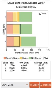 Summary: A snapshot of current soil water availability and crop stress status by SWAT zone for crop specific potential root zone.
Description: This shows the actual and potentially plant available water available by SWAT zone, based on the estimated maximum root zone for the crop type. The grey outlined bar represents the current Available Water (AW) status, while background colors indicate the soil’s total PAW capacity divided into stress categories. The table below provides a summary of the specific amount of available water in the potential root profile by zone. The available storage is the difference between the potential root profiles of field capacity and current water status. This quantifies how much water (assuming complete infiltration and no runoff) from irrigation or rainfall is needed to bring the potential root profile to field capacity.
Why It’s Useful: This visual describes how much of your soil’s water‑holding capacity is currently filled and whether your crop is experiencing any level of water stress. This view is a high‑level snapshot and does not show how moisture is distributed by depth within the soil profile, so it should be used alongside the depth‑based charts for a complete picture.
Plant Available Water (PAW) Status by Depth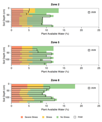
Summary: A snapshot of soil water availability by depth at a given point in time in the same format as the zone level description above.
Description: Shows how much water is available to the crop at different soil depths, highlighting how moisture is distributed through the profile. Shaded areas indicate current PAW, while background colors show total PAW capacity and stress levels. This helps identify whether moisture is near the surface for germination, in the early root zone for establishment, or deeper for late‑season use.
Why It’s Useful: Understanding where moisture exists in the soil profile has major implications for crop potential, especially in dryland systems.
- Moisture near the surface in spring provides important insight into germination potential and early season crop establishment.
- If soil moisture is limited at the 30–60 cm depth, crops may struggle to root deeply enough to access deeper reserves later in the season.
- Crops generally access water from the upper one third of their root profile first. Even if roots reach depth, they will preferentially use shallow moisture before tapping deeper layers.
Plant Available Water (PAW) Over Time by SWAT Zone
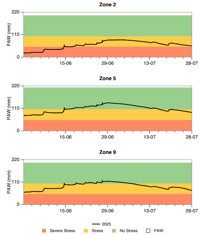
Summary: Tracks plant available water and crop stress across the growing season for each SWAT zone.
Description: Displays plant available water (mm) within the maximum root zone over time (as specified by the date selection in Plot Options) for each SWAT zone, with one chart per zone. The line shows seasonal PAW changes — rising after rainfall and declining when crop water use exceeds rainfall — while background colours indicate total PAW capacity and stress levels. Gaps in the line indicate periods with frozen soil. When comparison years are selected, each year is drawn in its own colour (the most recent year in black); tap the year legend to hide or show years across all zone charts at once.
Why it's important: Shows how water availability and stress changed during key growth stages, helping assess whether moisture was sufficient and explaining differences in crop performance and yield. When the line drops into the yellow or red bands, crops may have experienced water limitation.
Volumetric Water Content
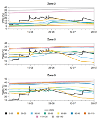
Summary: The volumetric water content values that are directly observed for each zone and depth.
Description: Presents volumetric water content (%) across all observation depths over time, with one chart per SWAT zone. Each colour represents a sensor depth (the depth label indicates the observed soil layer, e.g. 0–20, 20–35, 35–50 cm), and when comparing years, line style indicates the year. The 0–20 cm layer is not directly observed but inferred from water balance modeling. Both the depth legend and the year legend can be tapped to hide or show lines. When soils are frozen, these volumetric water content observations reflect only the liquid portion, resulting in significantly lower values that should be interpreted with caution.
Why it's important: Volumetric water content is the basis for all of the plant available water metrics reported in this app. This information provides an important, but complex, perspective of water dynamics. It is an important perspective to understand soil profile differences and can be helpful in system diagnostics.
Crop Water Use/Root Depth
Summary: Estimates how much water the crop has used through the season and how deep the crop's roots have advanced, for each SWAT zone.
Description: This view analyses the day-to-day changes in stored soil water to estimate crop water use and the advance of the crop rooting front. It has three display modes (switched in Plot Options):
-
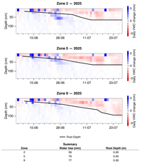
Daily
(Default): one panel per zone (and per year when comparing years) showing the daily change in stored soil water at each depth. Red indicates depletion (crop water uptake and evaporation), blue indicates recharge (rainfall or irrigation), and the black line overlays the estimated root depth advancing through the growing season. -
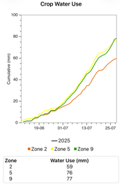
Cumulative
Total crop water use (mm) over the growing season (from the selected start and end dates), with one line per zone (zone = colour; year = line style when comparing years).
-
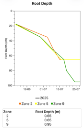
Root Depth
The estimated root depth (cm) advancing through the growing season, in the same one-line-per-zone format. The precision of the rooting depth relates to the observed soil layers and linear interpolation is applied to periods between the first observations of crop water use.
In the Cumulative and Root Depth modes, tap the zone or year legends to hide or show lines. A summary table below the chart shows the totals per zone up to the selected end date — total crop water use (mm) and/or current estimated root depth (m), depending on the mode in view.
Why it's useful: Crop water use ties rainfall and soil moisture together into a single agronomic picture: how much water the crop has actually consumed, and where in the profile it is drawing from. Comparing zones reveals where crops are working harder for water; comparing years shows how the current season's demand tracks against previous seasons. The estimated rooting front indicates whether the crop has reached deeper moisture reserves, which is especially valuable for late-season yield expectations in dryland systems.
 Soil Temperature
The Soil Temperature tab offers two views through the Select View dropdown: Time and Depth.
Soil Temperature by Time
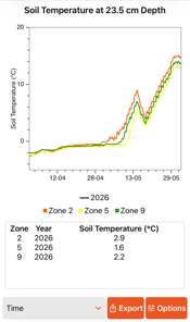
Summary: This chart shows soil temperature over time at a selected depth for each SWAT zone, providing a clear view of how soils warm through spring in each zone leading up to seeding.
Description: One combined chart plots soil temperature (°C) at the selected sensor depth for every SWAT zone, with zone indicated by colour and — when comparing years — year indicated by line style. The sensor depth is chosen in Plot Options (the shallowest available depth is 23.5 cm). A table below the chart lists the average soil temperature for each zone and year over the selected date range. Tap the zone or year legends to hide or show lines.
Why it's useful: Soil temperature is a critical indicator for timing seeding. Because the seedbed is shallower and generally warmer than the shallowest observed depth (23.5 cm), recommended temperatures at this depth are reached later than in the seedbed. Comparing temperatures across SWAT zones helps identify which parts of the field warm earlier or later.
Table 1: Crop Specific Minimum Seeding Temperature
|
Crop |
Minimum |
Source |
|
Cereal Crops (Wheat |
4°C |
Sask Ministry of Ag |
|
Canola and Mustard |
5°C |
Canola Council and Canada |
|
Peas and Lentils |
5°C |
Sask Pulse Growers |
|
Flax |
5 - 8°C |
Sask Oil Seeds |
|
Desi chickpea |
5°C |
Sask Ministry of Ag |
|
Kabuli chickpea, dry bean and soybean |
10°C |
Sask Ministry of Ag |
|
Corn |
8 - 10°C |
Manitoba Crop Alliance |
Soil Temperature by Depth
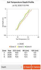
Summary: This chart shows soil temperature with depth for each of the observed SWAT zones on a selected date.
Description: The chart plots a temperature-versus-depth profile for each SWAT zone (zone = colour; year = line style when comparing years) for the date selected in Plot Options, with the date and time of the latest reading shown at the top. A table below the chart lists the temperature at the three observed depths — 23.5 cm, 80 cm, and 120 cm — for each zone and year.
Why it's useful: Soil temperature profiles reveal different information throughout the year. During snowmelt, they show how soil thaws from both the surface, as energy inputs rise, and from below, due to geothermal heat. In the growing season, profiles indicate soil heat variation across zones based on factors like plant canopy and residue cover, which can affect plant heat stress. In fall, these profiles help track when and how quickly the soil freezes, offering insights into the potential for snowmelt infiltration considering current soil moisture levels.
SWAT WATER Station App FAQ
- What do I do if I think my rainfall data is incorrect?
Tipping‑bucket rainfall measurements can occasionally be incorrect for a few reasons. In most cases, this happens due to debris in the gauge or wiring damage, and these issues are often caused by rodents or birds. In other cases, rainfall patterns may simply differ from nearby stations during localized events, which can appear unusual but still be accurate. If your rainfall values seem unrealistic or don’t match what you observed in the field, please let us know. We can review the station, identify the cause, and update the rainfall data on the admin side if needed. -
Why don’t soil moisture or PAW values match what I expect for my soil type?
The system learns your soil properties over time. As more data is collected, the calibration improves and PAW estimates become more accurate. Early readings may differ from traditional charts but will become more representative as the field data accumulates. - Why is the soil temperature sensor at 23 cm instead of at seed depth?
The probe must be fully buried, so the shallowest temperature sensor ends up at 23 cm. This depth is simply an installation trade‑off. Soil temperatures at the 23cm depth following melt will be cooler and lag seedbed soil temperatures so typical seedbed crop specific temperature thresholds will be need to be reinterpreted with caution if this information is being used to inform seeding timing. - Why does my soil moisture data disappear in winter?
The sensors only detect the liquid portion of soil water, so when the soil is fully frozen, they do not detect any moisture. During these frozen periods, Volumetric Water Content (VWC) will still be visible, but calculated Available Water (AW) figures are not displayed. Instead, the app shows a message stating "Observations contain frozen values" to indicate that frozen conditions prevent accurate calculation of water availability. To understand true winter soil moisture conditions, use the pre‑freeze fall readings, which provide the best indication of soil water stored going into winter. - Why do different SWAT zones show different moisture and temperature patterns?
Landscape position affects water movement, drainage, runoff, and heat accumulation. Lower‑lying zones may stay wetter and cooler, while upper slopes warm and dry earlier. The station sensors are designed to capture these natural differences. -
How do I compare this season against previous years?
Open Plot Options on any chart and select one or more years under Comparative Historical Years. The selected years are overlaid on the chart, aligned by calendar date, and the chart legend identifies each year. Data is available from the season of install and onward. The Wind Rose is the one chart limited to a single year at a time. - How often are readings updated in the app?
Sensor readings are logged by the station every 30 minutes and transmitted every hour. The app displays the latest values as soon as they are received. If your station fails to transmit due to a service issue, you can determine when the last data was received by checking the timestamp shown in the dashboard. - What does Plant Available Water (PAW) actually mean?
PAW represents the portion of soil water that the crop can extract. The initial field capacity and wilting point values are set based on your soil texture, and the system then refines these estimates over time as more measurements are collected. - Why does rainfall sometimes not match nearby weather stations?
Rainfall can be highly localized, especially from scattered showers and thunderstorms. The on‑site rain gauge gives field‑specific measurements that may differ from regional stations several kilometers away. Please contact the weather station manager or your agronomist if you still think you rain gauge values are not accurate. - Why does high‑intensity rainfall not always increase deep soil moisture?
High intensity storms often exceed the soil’s infiltration capacity, leading to runoff and the greatest accumulation of water in lower lying areas (SWAT zones 5-10). In contrast, lower intensity rainfall is more easily absorbed and contributes to more uniform soil water recharge. - Why is my wind direction or speed different from local forecasts?
Wind can vary significantly at the micro‑scale due to sheltering, topography, or vegetation. Your station measures conditions at your specific field location. - Can I export my data?
No bulk data export function is available within the Mobile App. Raw data including observed rainfall, volumetric water content and soil temperature (and weather parameters if a SWAT WATER Station has a weather sensor) is available upon request. - What should I do if a sensor shows a flat line or missing data?
If you notice a sensor is consistently flatlining or displaying missing values, first check the physical installation for any visible damage or loose connections at the edge of field data logger. Ensure that the station’s power supply is intact and that the sensor cables are securely attached. If these steps do not identify or resolve the issue contact SWAT Support.
CONTACT